
OVERVIEW
CHALLENGE
Redesign the guest check-out flow to make it as easy and quick as possible to increase success numbers.
ROLE
During my work on this project, I was conducting competitive research, developing wireframes and mockups, creating prototypes.
Results
*To SEE ALL DESIGNED SCREENS use CLICKABLE PROTOTYPE on the bottom of this page
SOLUTIONS
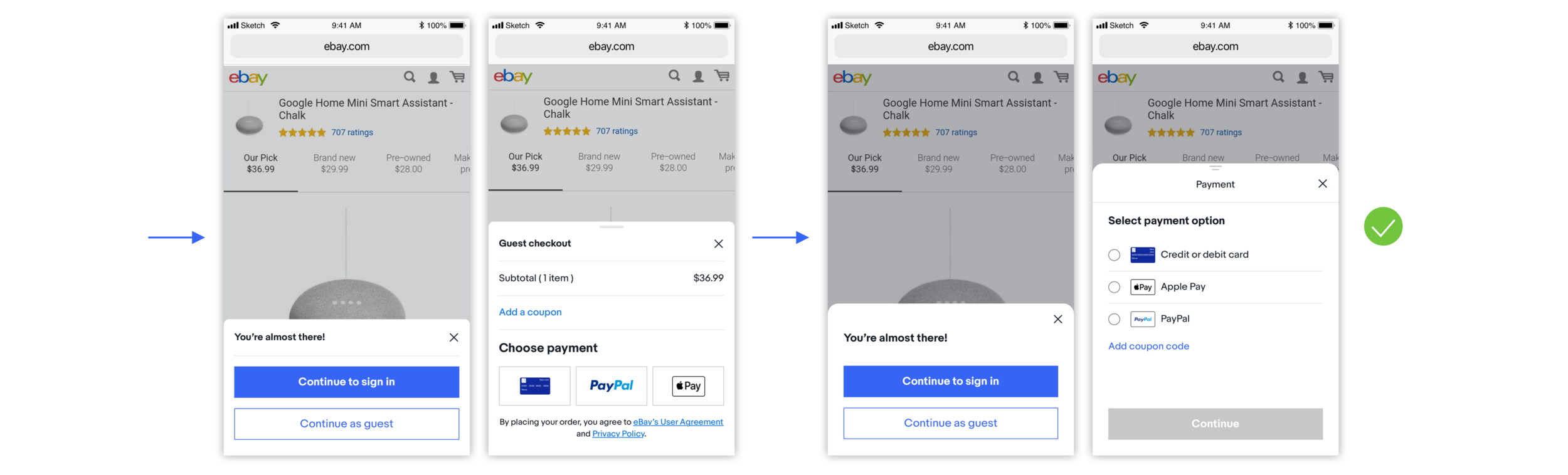
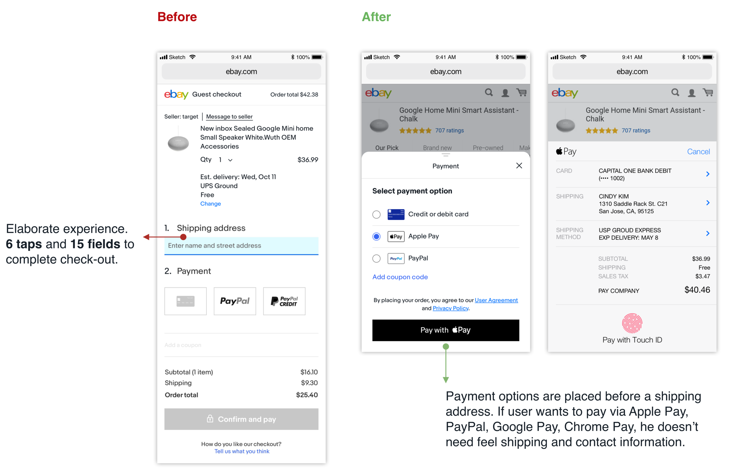
Place payment options before a shipping address and contact information to reduce the number of clicks for users to wants to pay via Apple Pay, PayPal, Google Pay, and Chrome Pay.
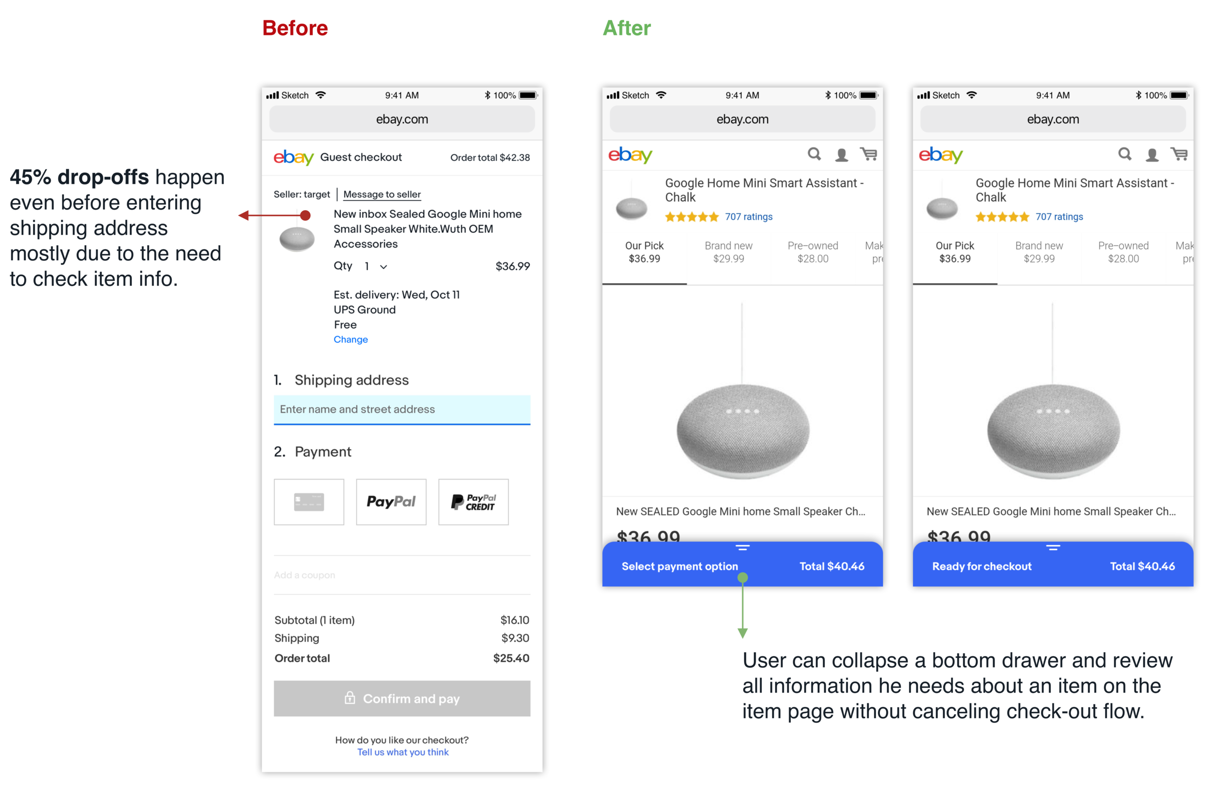
Use a bottom drawer to give users the opportunity to review item description during check-out flow.
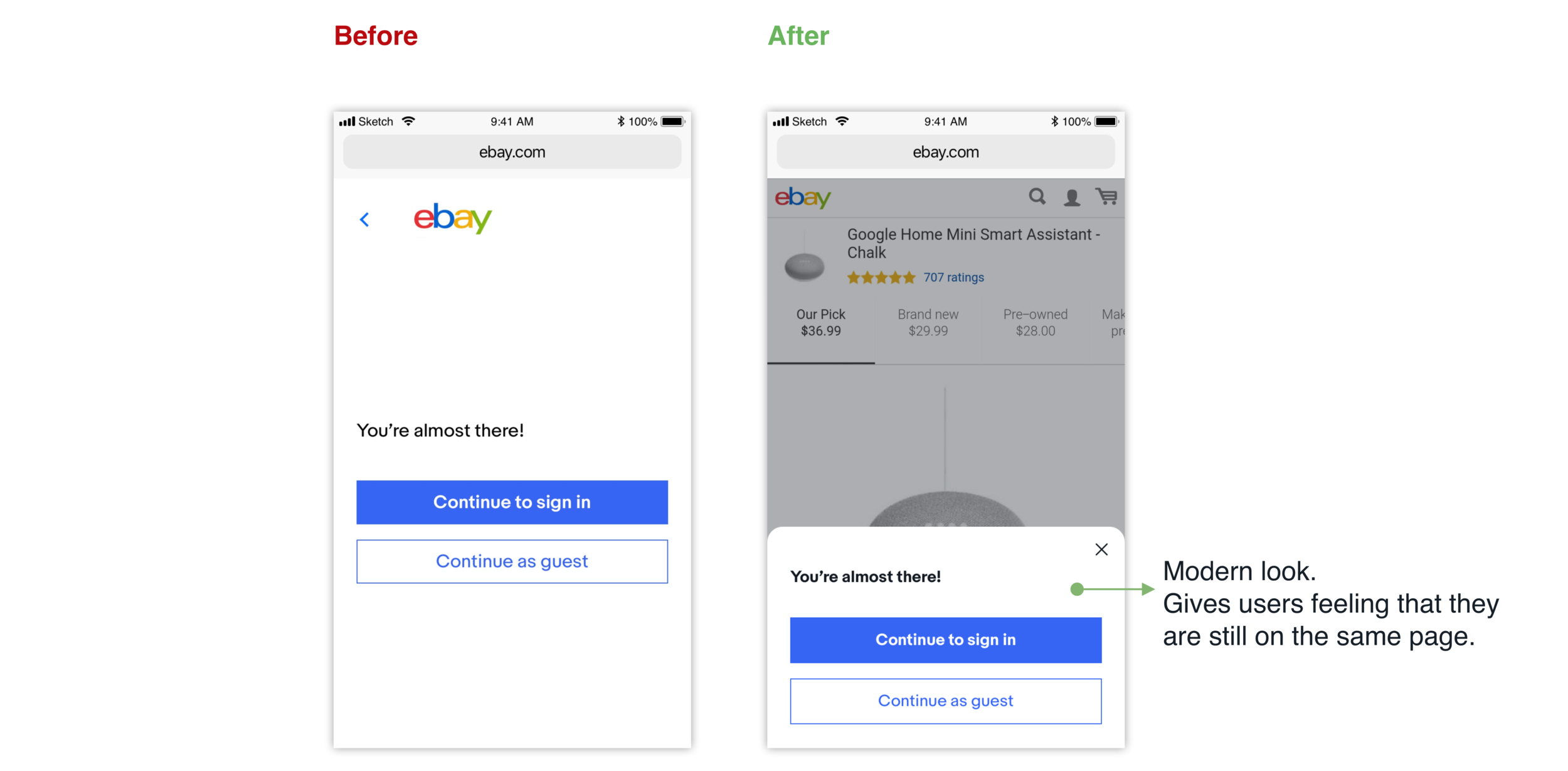
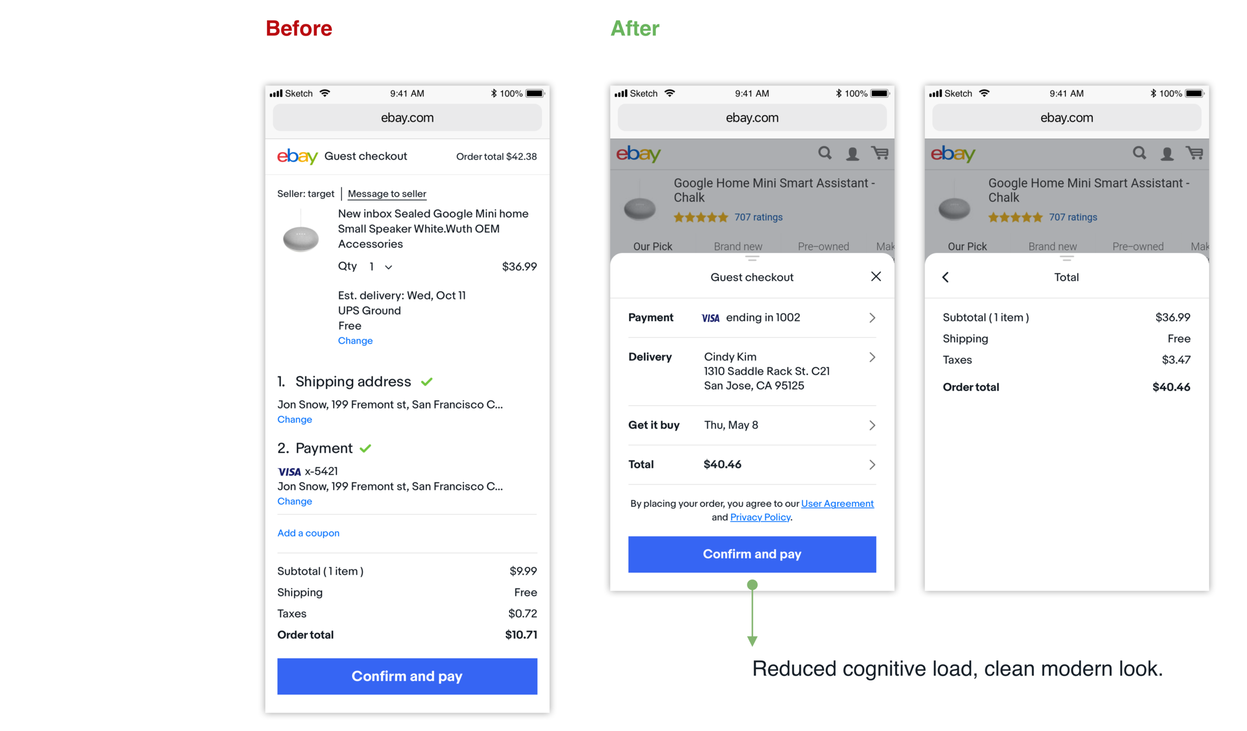
Create modern experience, increase visual consistency and reduce cognitive load.
THE DESIGN PROCESS
Before I started working on the redesign of guest check-out flow, I analyzed a lot of data I got from a project manager and eBay research team. I was surprised to see how many early drop-offs (45%) happens even before entering shipping address. This happened mostly due to the need to check item information.
It sparked my curiosity, I was eager to find an elegant solution for solving this problem.
MARKET RESEARCH

I kicked off the Market Research phase by looking at the websites (mWeb, app) of fifteen e-commerce companies. I was inspired by some of our competitors to try a bottom drawer for the check-out flow. I kept my explorations and uncovered some common pros and cons of bottom drawers, which helped to guide my design decisions along the way:
Cons:
Lack of space, need to fight for every pixel
It may be challenging to use if it's necessary to type a lot of information (autofill helps)
Pros:
Modern look
Speeds up processes
Very good for simple tasks
Wireframes
After researching and analyzing all the data, I generated wireframes to express some initial ideas.
Mockups
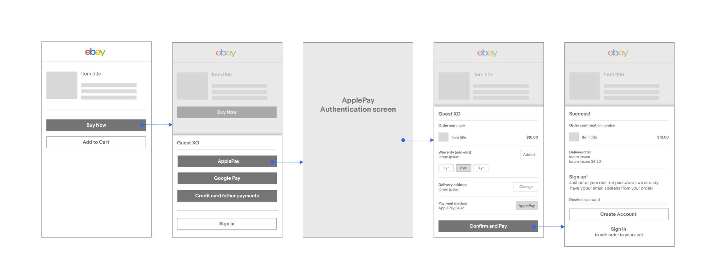
After discussing all the ideas with the project manager, I transformed wireframes to mid-fi mockups. I made a lot of iterations for changing and improving every single screen. It was a long and very exciting process. Below you can see screens which illustrate the evolution of one of the drawers for guest check-out flow.
Example: THE BOTTOM DRAWER EVOLUTION
Moving forward with the process, I summarized all my thoughts and feedback I got from the team. Since this project was at the intersection of three different departments: Identity, Payment, and Check-out, I had to satisfy all their requirements along with users needs.
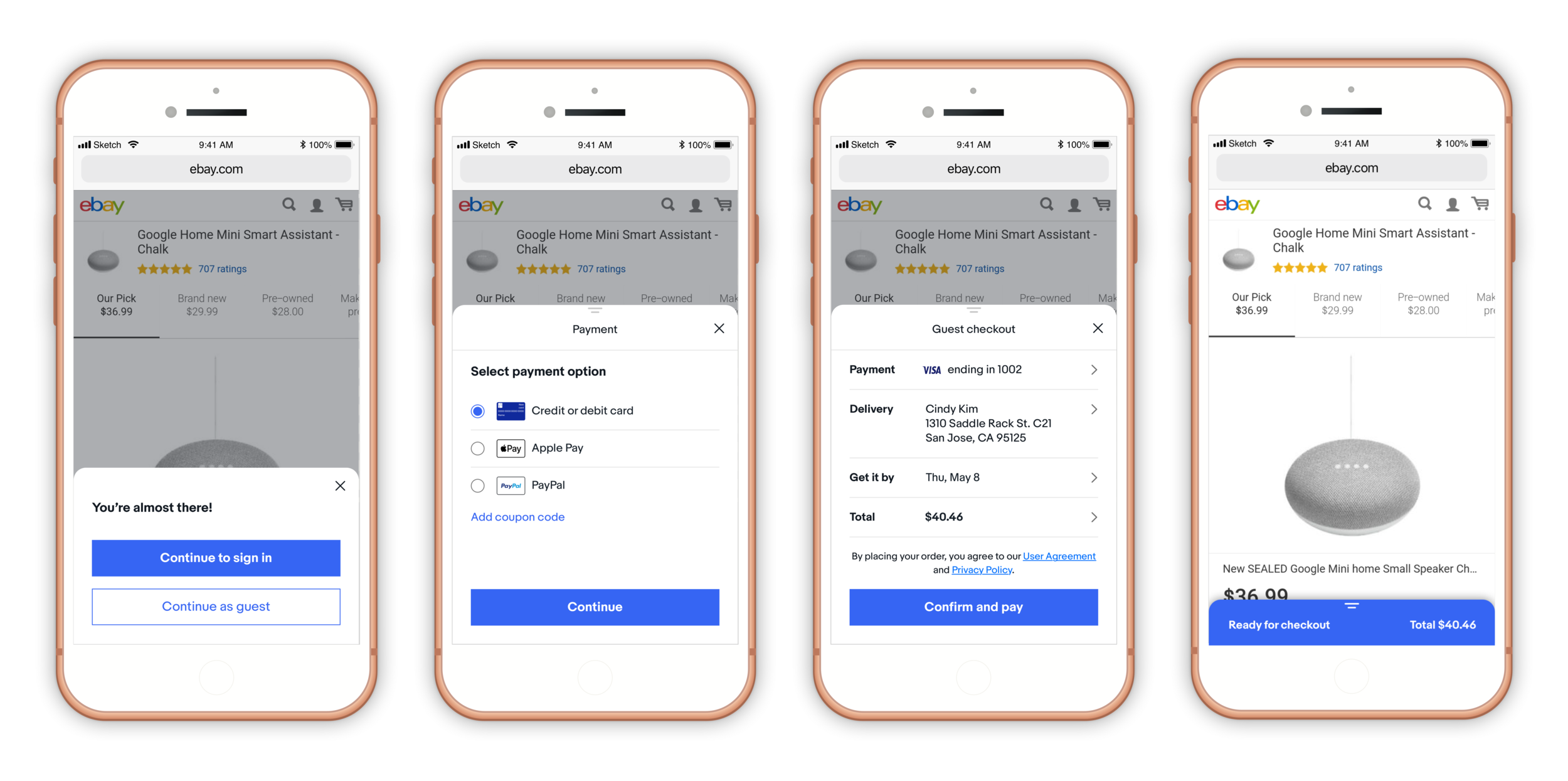
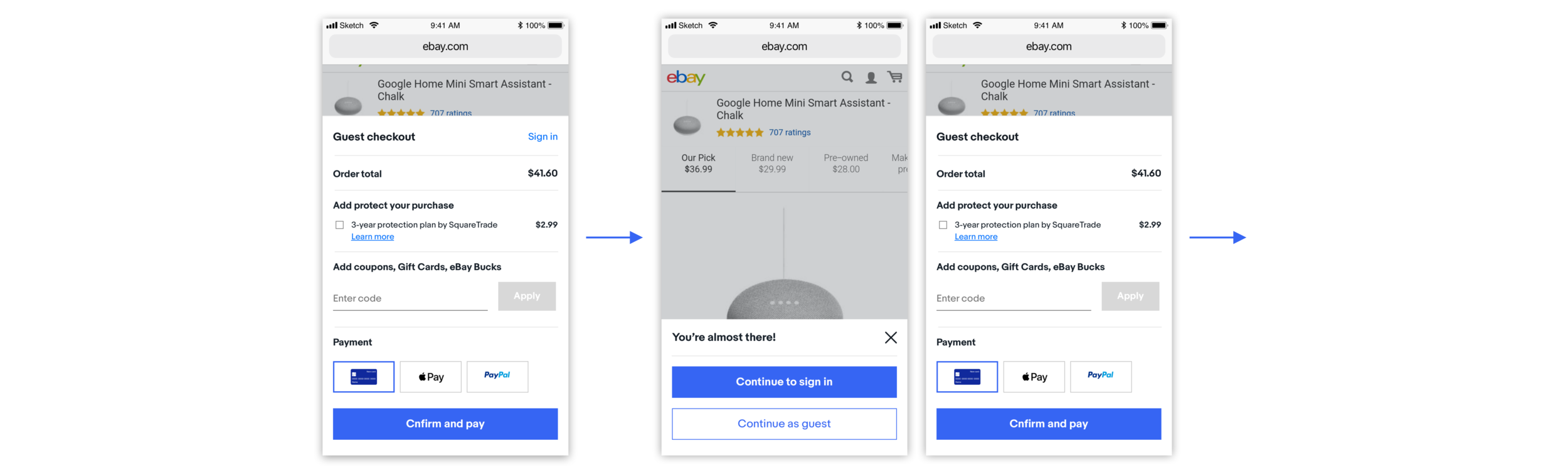
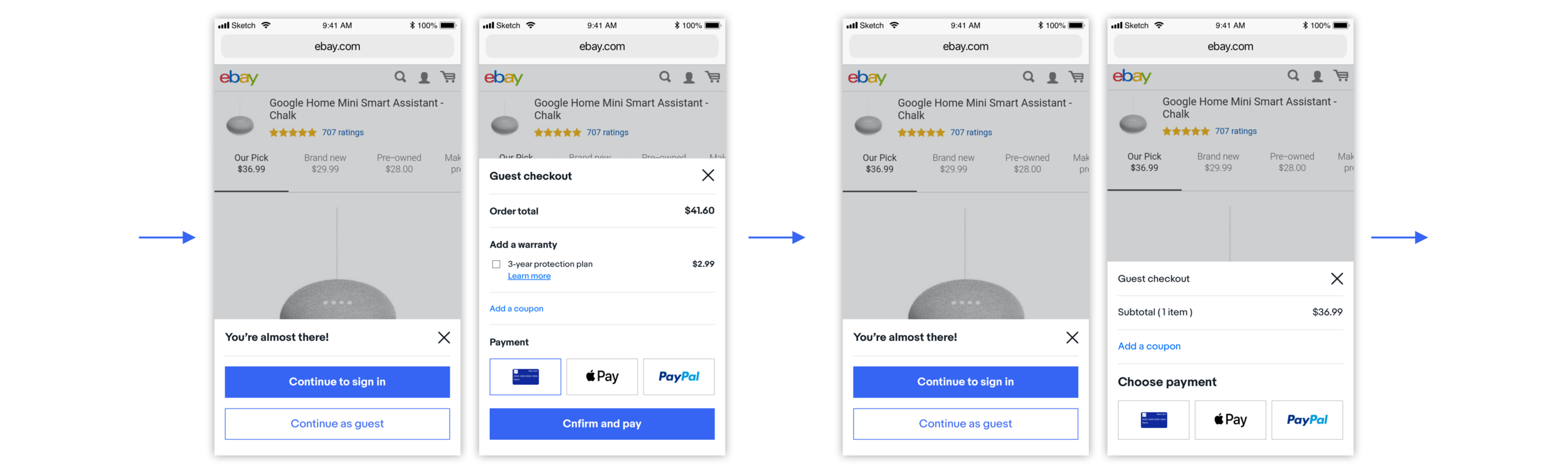
Below are the screens showing a difference between old and new design:
Clickable prototype
To demonstrate the proposed flow for guest check-out, I generated a clickable prototype.
FINAL THOUGHTS
Although this project was focused on improving check-out experience for guests, I believe that the same approach can be very beneficial for users (eBay members) who have an eBay account with prefilled shipping and payment information as well.