
OVERVIEW
ROLE
As a UI/UX Designer, I was actively involved throughout all stages of the project including research, ideation, testing & prototyping
CHALLENGE
Redesign the hotel search-to-booking experience to make it more simplified and intuitive for the purpose of increasing booking rates.
RESULTS
The Design Process
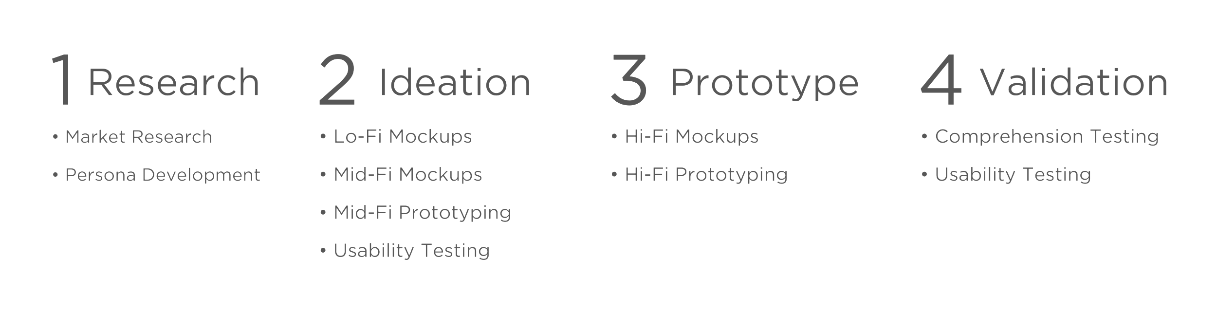
Research
MARKET RESEARCH

We kicked off the Research phase by looking at the websites of other companies who have a similar hotel search-to-booking experience. We uncovered common patterns in the websites of these companies which helped to guide our design decisions along the way.

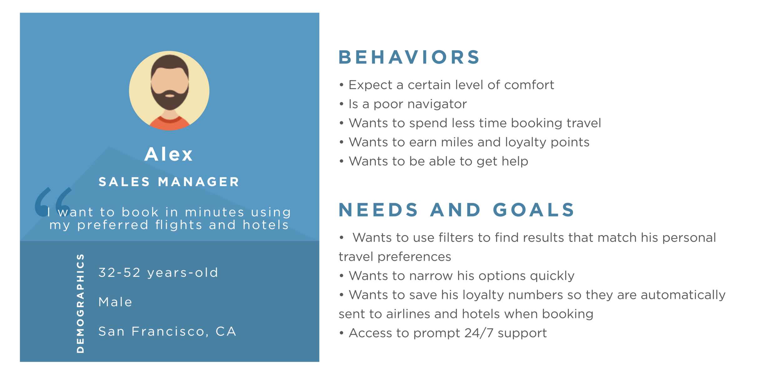
Persona Development
Product manager provided us a lot of data about current users, their needs and goals. We translated all this data to a user persona, which informed our design decisions during all project steps.
Ideation
After research, we generated lo-fi mockups to express our initial ideas. The team focused on the benefits of the product, restructuring the pages information hierarchy better communicate value upfront. We discussed our ideas with the client. Unfortunately, the company didn't have enough resources to implement all our ideas immediately, so we had to prioritize them. We transformed our lo-fi wireframes to mid-fi mockups based on the feedback from an engineering team and a product manager.

As a next step, we had the first round of user testing with 7 different people via online video hangouts for mid-fi validations. During testing, users were given a clickable prototype, answered questions for each page, and walked us through a few given scenarios. The sessions were also recorded with their permission so that we could carefully identify areas of frustration of the UI and areas that were overlooked.
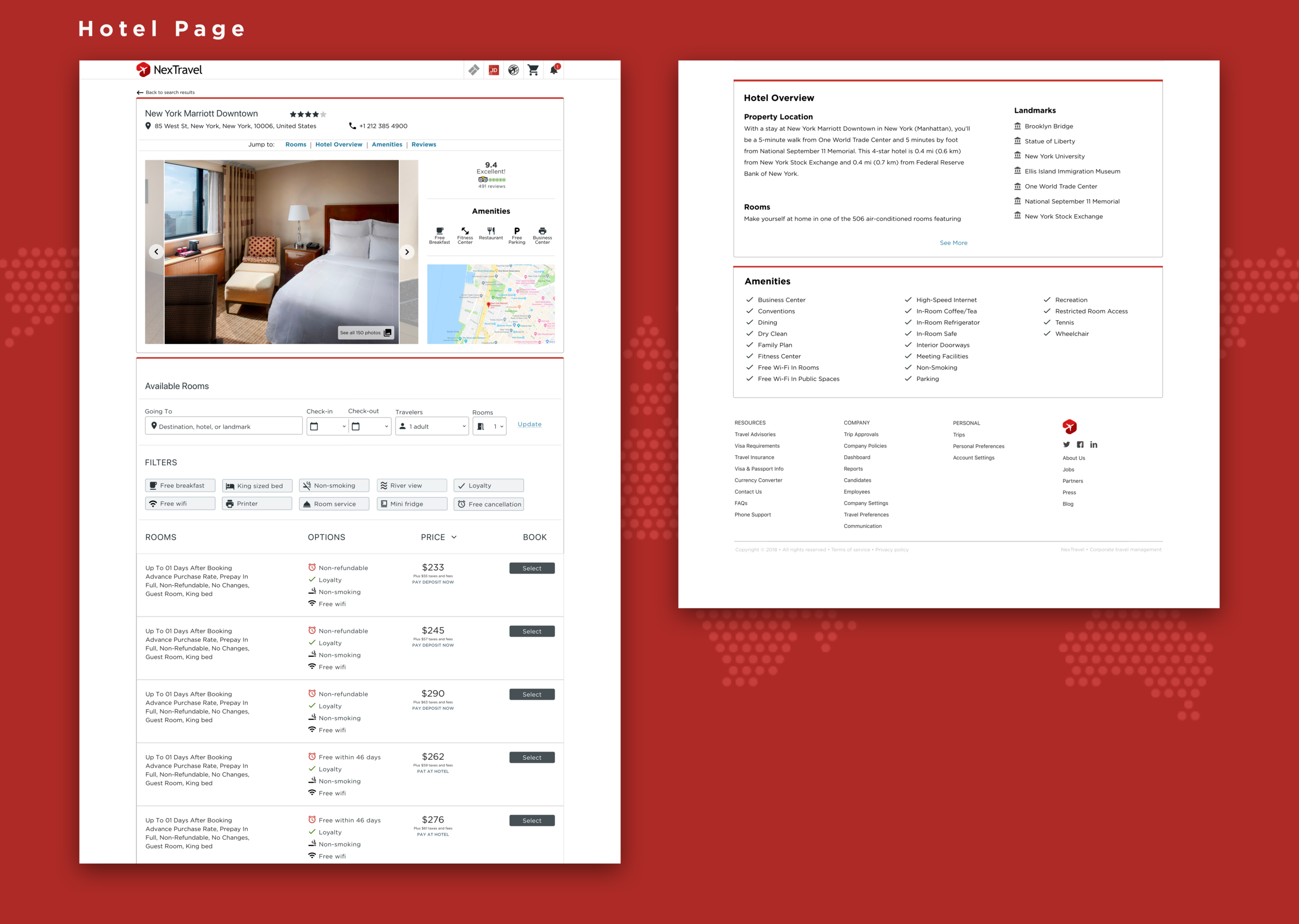
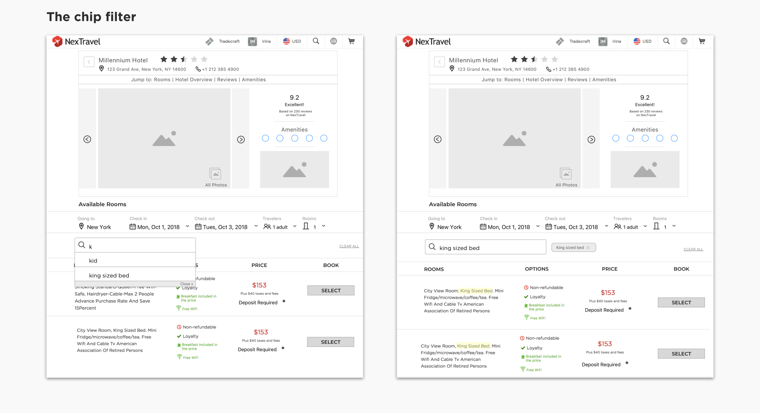
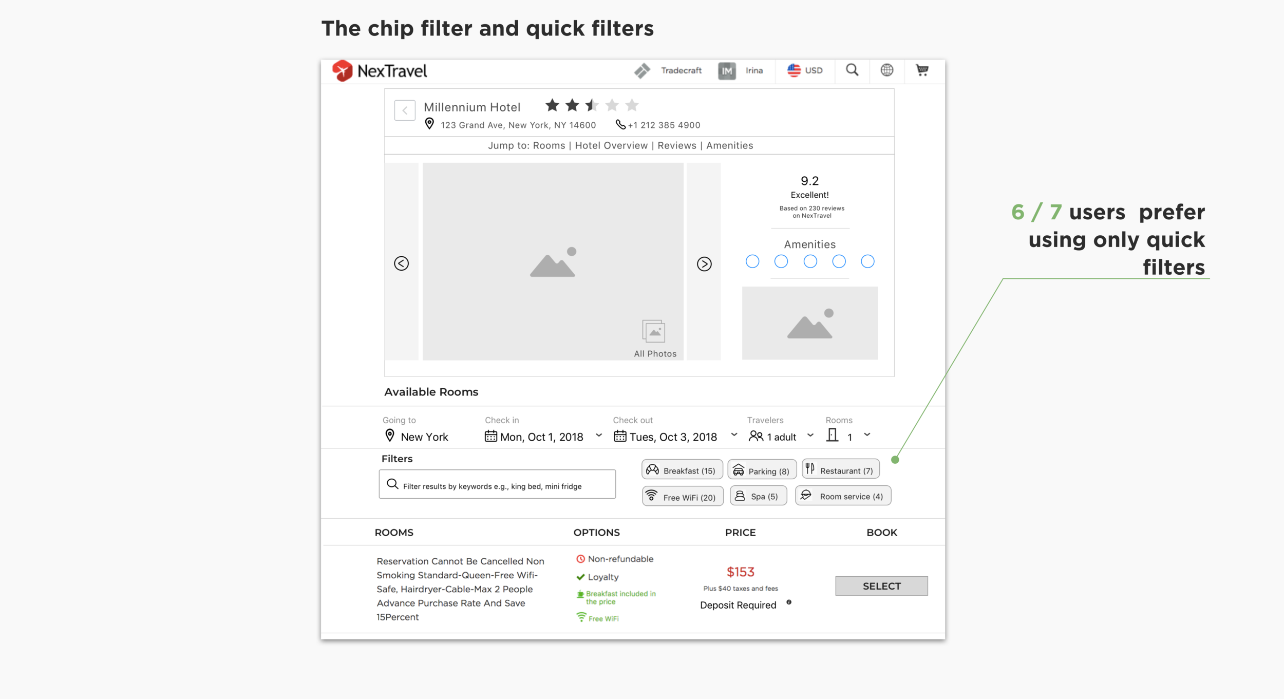
The first round of user testing revealed that user's comprehension level is very high, and helped us to choose the most useful and convenient filters for existing users. For example, in the beginning, we were considering two types of filters for the Hotel Page: the chip filter and/or quick filters. The chip filters allowed users to search for keywords and create their own filters. Many users found the chip filter helpful, but when given the option to use chip filter and/or quick filters, 6/7 users said they prefer using only quick filters instead.
Prototype
HI-FI MOCKUPS
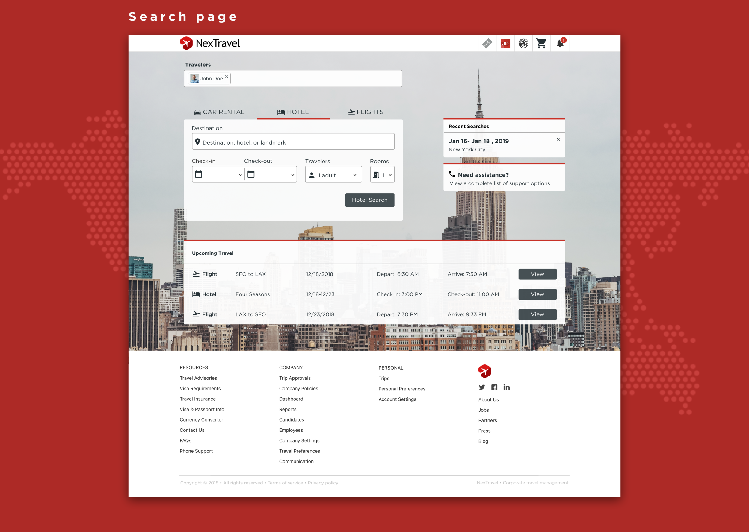
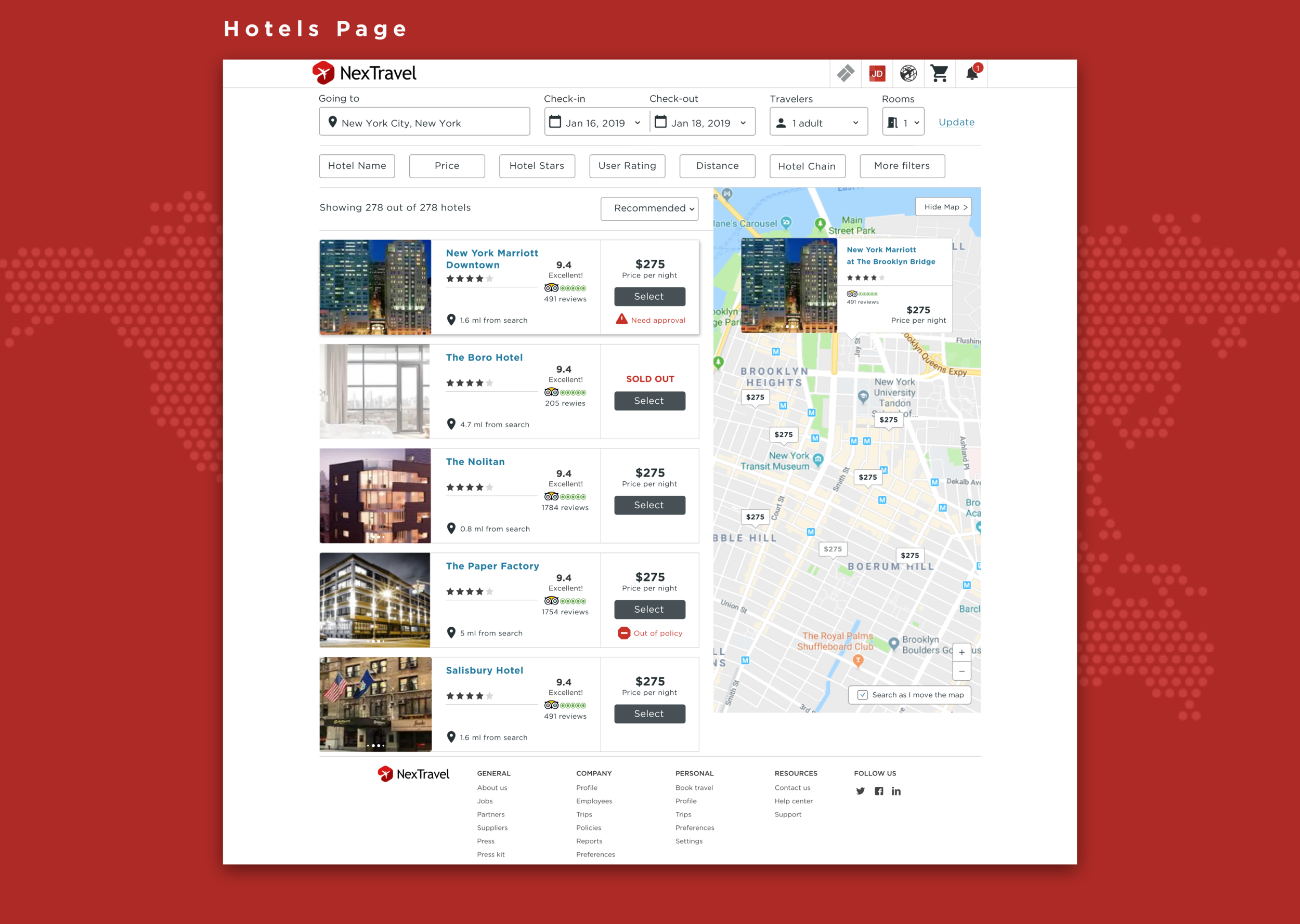
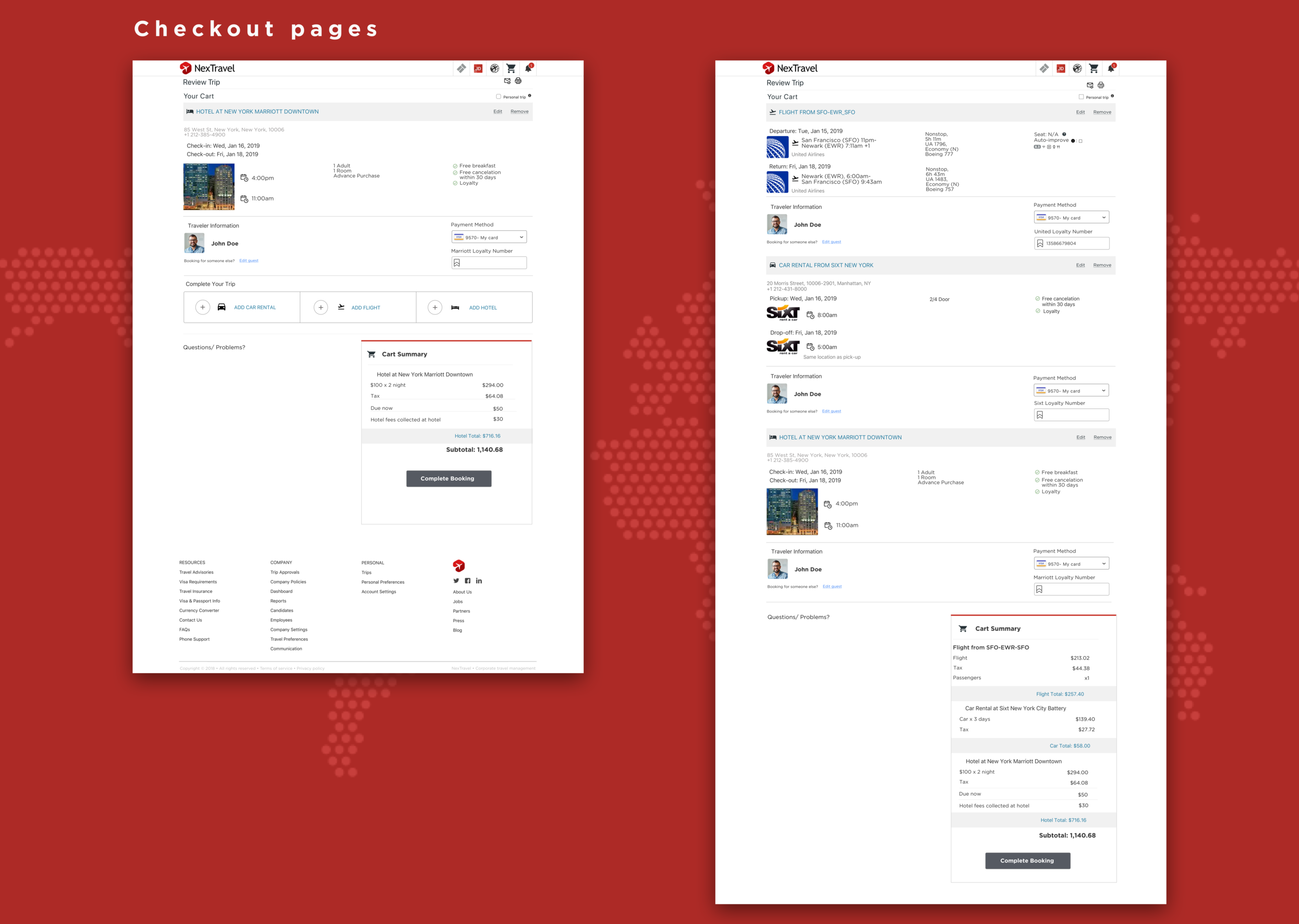
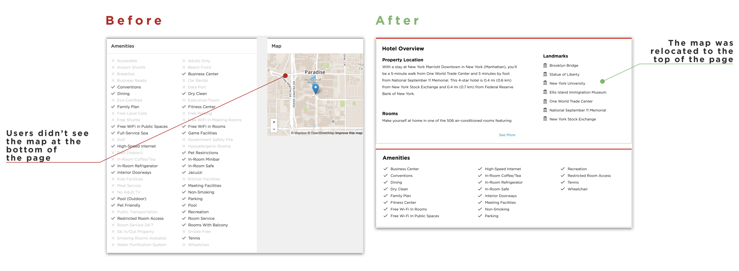
Moving forward with the process, we summarized all our ideas and findings from mid-fi validations and turned them into hi-fi prototypes. Below are the screens showing the Hotel Page design before and after as an example.
Example: HOTEL page Before and After


Validation
We conducted a final round of user testing on our hi-fi designs on 7 existing users to see how our final solution impacted viewers. We used consistent questions and testing conditions across all tests for comparison.
Testing showed that the new site increased the speed and simplicity of the search-to-booking process.

Final Thoughts
The final thoughts after this redesign were:
1. It's very valuable to think about grid settings, color palettes, and components in advance. It's easier to double check than to redesign.
2. There is a value in additional time to merge files at the hi-fi stage of designing.
In the end, we delivered a design that was visually consistent, clean, and organized. As a learning experience, this redesign helped emphasize the importance of scheduling as well as a team coherence.